Welcome to the Market Imbalance Monitor (MIM)! This guide will help you understand how to interpret the data and insights we provide, so you can make informed decisions with confidence.
Overview of MiM
The MIM report provides critical information about market imbalances during key trading windows. Imbalances indicate whether there’s more buying or selling interest for a specific security at market open or close. The MIM gives you a snapshot of institutional order flow, helping you gauge the market’s momentum during auction periods.
Time Frame: The MIM focuses on the opening and closing auction periods of the market, specifically from 8:00 AM to 9:30 AM ET and 3:50 PM to 4:00 PM ET. On early close days, this time frame is adjusted from 12:50 PM to 1:00 PM.
Summary and Gauges

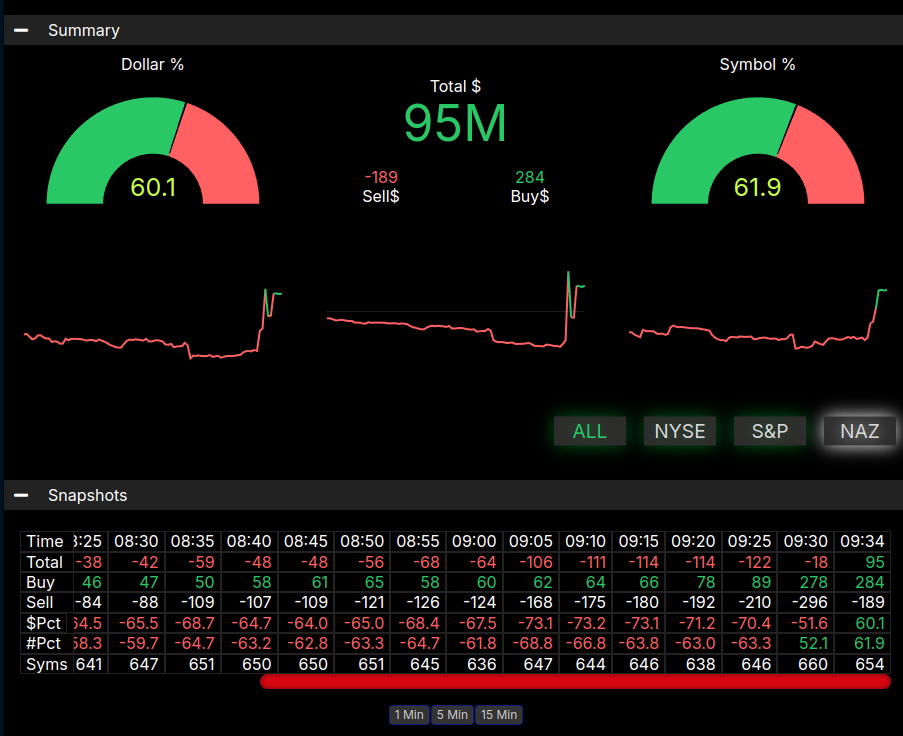
The top of the chart is the summary. The gauge on the left shows the Symbol % indicating how many symbols have buy imbalances compared to sell imbalances. As a rule of thumb, a reading greater than 66% or less than -66% would indicate a bullish lean or a bearish lean, respectively. The numbers in the middle of the top row are the “top” line numbers. They represent the total notional values of all the symbols with buy imbalances (buy$) and those with sell imbalances (sell$). The difference between these values is the top number, which is the total imbalance. Below that first row are the sparkline charts which display the movements of the three gauges over time. The next row down is the ALL, NYSE, S&P, NAZ buttons. This filters the symbol list for those four categories. Below those filters are snapshots of the values for each minute. You can quickly scan these to see trends and watch for growing leans.
Top Ten Table

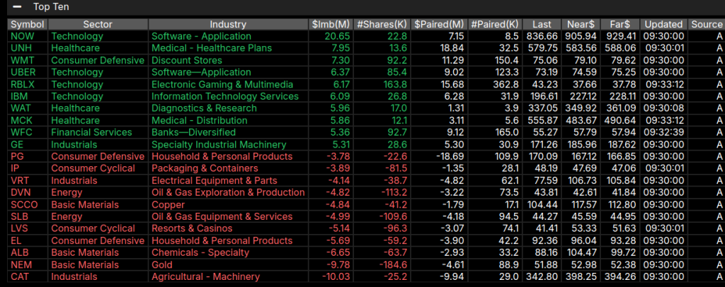
The next table down is the Top Ten table. This is a real-time sorted list of the 10 symbols with the largest buy imbalance and the 10 symbols with the largest sell imbalance. It gives you a vision of what is driving the imbalance. You will sometimes see symbols that are having large stock transactions on the close, representing mergers or other stock options. These are not market indicative and allow you to discount that dollar amount. You can also see the trenders, whether they are the largest Nasdaq stocks or energy stocks. Again, it gives the trader a feel for what is driving the action into the open and close.
Sectors

The MIM also provides a sector view. This table is displayed in real-time during auction hours and is sorted not on the total imbalance dollars, but rather on the symbol percentage lean. This helps to find the hot sectors and is useful in discerning market rotations.
Tips for Effective Use
- Correlate with News: Imbalances often coincide with major news events. Cross-check MIM data with current news to get a clearer picture of market drivers.
- Focus on High Volume Symbols: Symbols with higher volume typically provide more reliable imbalance data. Prioritize these to avoid false signals.
- Track Historical Patterns: Over time, you can use the MIM to recognize repeating patterns that might offer an edge in your trading strategy.
Join the MIM trading team, Click below:
